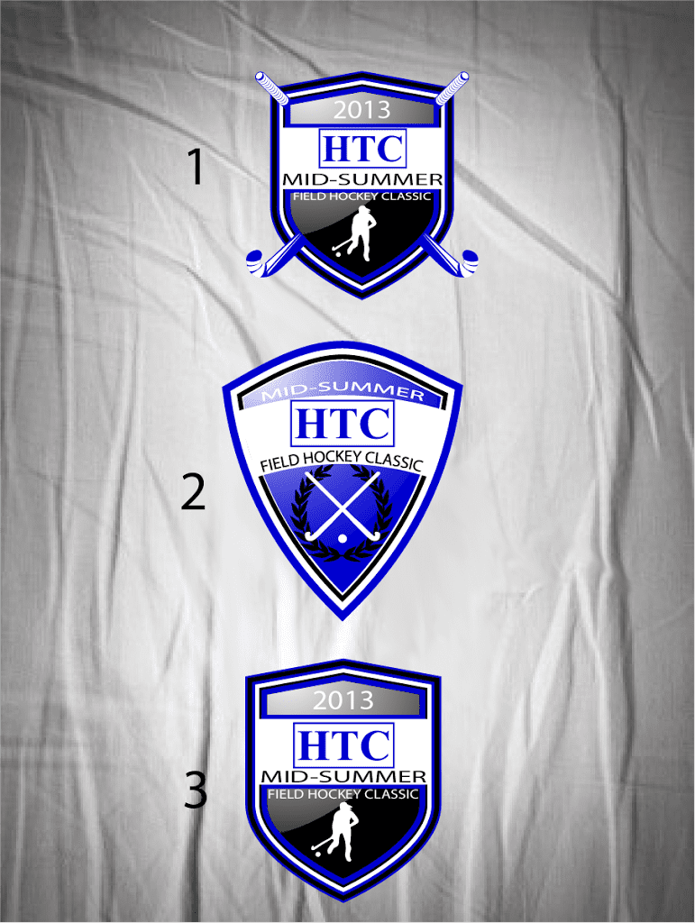
Field hockey, a sport characterized by agility, teamwork, and precision, often requires an equally dynamic logo to represent the team’s spirit and identity. Designing a logo for the Field Hockey Team at HTC presents unique opportunities to encapsulate the essence of the game through visual elements. Here are some inspiring ideas for conceptualizing such a logo.
1.
Incorporate Elements of the Game
A logo that highlights key components of field hockey—such as the stick, ball, and players in action—can create a strong visual impact. Using silhouettes of players in motion can convey energy and passion. For instance, the incorporation of a player dribbling a ball can symbolize agility, while the stick can be stylized to form the letter ‘H’ or ‘T’ of HTC.
2.
Color Scheme
Colors evoke emotions and convey messages. For a field hockey logo, vibrant colors that reflect the team’s identity can be used. Combining shades of green and white can suggest the field and purity of the game, while bold colors like orange or blue can signify energy and determination. Using color gradients can also add depth and modernity to the design.
3.
Typography
Selecting the right font is crucial in logo design. A bold, modern sans-serif font can imply confidence and strength, perfect for representing an athletic team. Alternatively, a more traditional serif font can convey professionalism and heritage. Integrating the typography with graphical elements—such as positioning the text around a hockey ball or stick—creates a cohesive design.
4.
Abstract Shapes
Consider using abstract shapes to form the logo. This method allows for a unique representation that stands out. For instance, using circular patterns to encapsulate the essence of teamwork can create an inclusive feel. Abstract logos can also be versatile, adapting well to various applications, from uniforms to promotional materials.
5.
Mascots and Symbols
Leveraging mascots can add a fun and engaging aspect to the logo. If HTC has a specific mascot, incorporating this into the logo can strengthen team identity. Alternatively, using symbols like shields or emblems can give a sense of tradition and pride.
6.
Vector Graphics for Versatility
To ensure the logo is adaptable for multiple uses—such as merchandise, digital platforms, and large prints—designing it in vector format is imperative. This ensures scalability without loss of quality and allows for easy color adjustments in future applications.
7.
Simplistic Designs
Sometimes, less is more. A minimalist logo that focuses on a single element, such as a hockey stick crossing a ball, can be just as striking as a more elaborate design. Such logos are often more memorable and can easily be recognized at a glance.
Browse Our Services
At UrArtStudio, we specialize in creating custom event logo designs that are tailored to meet your specific needs. Whether you’re launching a new team or refreshing an existing logo, our team is ready to assist.
To explore more about our services, please visit our site:
- To make a custom design request, please visit: Custom Design Requests
- Explore all our print-ready designs here: Print Ready Designs
- Browse designs with adjustable fonts here: Adjustable Font Designs
Keywords
field hockey logo, team identity, design elements, color schemes, abstract design, vector graphics, typography, mascot logo
Hashtags
#FieldHockeyLogo, #TeamIdentity, #LogoDesign, #CustomLogos, #VectorGraphics, #ModernDesign, #CreativeLogos, #SportLogos


