

Color theory is a fundamental aspect of art-making that profoundly influences the emotional and aesthetic impact of a piece. In landscape painting, where color can evoke mood, depth, and atmosphere, understanding how to choose the right palette is essential. This blog post will delve into the principles of color theory specifically tailored for landscape artists. We’ll explore how different colors work together, how to create harmonious palettes, and the importance of complementary and analogous color schemes in your acrylic landscape paintings. Let’s embark on this colorful journey to hone your artistic skills!
1. Understanding the Color Wheel
At the core of color theory is the color wheel, a visual representation of colors arranged in a circular format.
- Primary Colors: The three primary colors (red, blue, and yellow) cannot be created by mixing other colors. They are the foundation for understanding all other colors.
- Secondary Colors: These colors are formed by mixing equal parts of two primary colors. For example, mixing blue and yellow produces green; red and yellow create orange; and red and blue yield purple.
- Tertiary Colors: These are produced by mixing a primary color with a secondary color. Examples include red-orange and blue-green. Familiarity with these categories will help landscape artists mix colors more effectively.
2. Complementary Colors: The Secret Weapon
Complementary colors are opposites on the color wheel, and using them strategically can enhance your landscape paintings.
- Creating Contrast: Complementary colors can create strong contrasts that draw attention and add visual interest. In landscapes, placing a bright green tree against a deep red-brown mountain can make both colors pop, enhancing the overall impact of your painting.
- Balancing Color Temperature: Using complementary colors helps balance warm and cool tones in your painting. For instance, if you have warm hues in the foreground, a cool complementary color in the background can create balance and depth.
- Creating Grays and Neutrals: Mixing complementary colors can result in muted tones that are ideal for shadows and neutral backgrounds. This can help create a more realistic and grounded landscape.
3. Analogous Colors: Creating Harmony
Analogous colors sit next to each other on the color wheel and are excellent for creating harmony in landscape paintings.
- Subtle Transitions: When using analogous colors, such as blue, blue-green, and green, you can achieve smooth transitions in your landscapes. This technique is particularly effective for painting skies at dawn or dusk, where the colors blend beautifully.
- Mood and Emotion: By sticking to analogous colors, you can evoke specific moods in your landscapes. Warm color combinations (like reds, oranges, and yellows) can convey warmth and vibrancy, while cool combinations (blues and greens) often evoke tranquility and calm.
4. The Psychology of Color
Understanding the psychology of color can greatly influence how viewers perceive and feel about your landscape paintings.
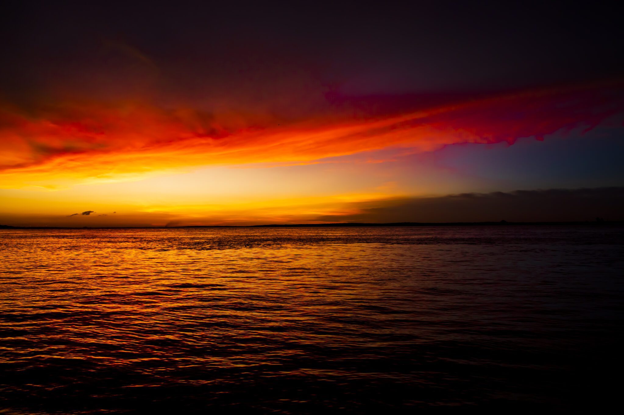
- Warm Colors: Colors like red, orange, and yellow tend to create feelings of excitement, warmth, and energy. They can be used to illustrate sunsets, autumn leaves, or vibrant flower fields, infusing your painting with life.
- Cool Colors: Blue, green, and purple are often associated with calmness, serenity, and tranquility. These colors are perfect for depicting serene lakes, forests, or misty mountains.
- Neutral Colors: Whites, blacks, and grays can create a sense of balance and allow other colors to shine. They can also serve as background colors to help emphasize key features in your landscapes.
5. Creating a Limited Palette
A limited palette can simplify your painting process and help create cohesive artwork.
- Fewer Choices, Greater Focus: Limiting your color choices to a few select hues encourages you to focus on mixing and blending, which can improve your skills over time. It reduces the decision-making process and allows you to develop a unique style.
- Consistent Color Harmony: Using a limited palette can help ensure harmony among colors. When you mix fewer colors, the interactions between them become more predictable and cohesive, leading to a more unified final piece.
- Experimenting with Tints and Shades: A limited palette enables you to create various tints (adding white) and shades (adding black) with your chosen colors, adding complexity and depth without overwhelming your canvas.
6. Observational Techniques: Study the World Around You
While color theory provides a framework, observation remains a key aspect of mastering color selection in landscape painting.
- Natural Observations: Spend time observing natural landscapes to understand how light affects color. Pay attention to how colors shift at different times of day or in different weather conditions; how sunlight can lighten colors, while shadows can intensify others.
- Color Mixing from Nature: Create small color swatches from nature, capturing the hues you see in leaves, water, and skies. Use these samples to guide your palette and ensure the accuracy of your representation.
- Photographs and Reference Images: Collect your own photographs of landscapes or use high-quality reference images to analyze color combinations in various environments.
7. Tools for Working with Color
Several tools can aid in mastering color theory and help you choose the perfect palette for your acrylic landscapes.
- Color Wheels and Charts: Keep a color wheel on hand for reference. It can help you visualize relationships between colors and easily identify complementary and analogous colors.
- Mixing Charts: Create a mixing chart by experimenting with combinations of colors. Document the results as swatches, which will serve as a quick reference for future paintings.
- Digital Color Pickers: Software and apps that feature color picking tools can assist in identifying and experimenting with digital palettes before applying them to canvas.
8. Building Your Personalized Palette
Transforming learned color theory into practice requires developing a palette that resonates with your artistic voice.
- Start with Base Colors: Choose a base of primary and secondary colors to form the foundation of your palette. For instance, a classic landscape palette might include titanium white, ultramarine blue, cadmium yellow, burnt sienna, and permanent red.
- Introduce Custom Colors: As you paint more landscapes, consider introducing personal favorite hues or specialty colors that resonate with your style. This allows you to create a signature palette that feels uniquely yours.
- Update Regularly: Don’t be afraid to change your palette as your artistic style evolves. Periodically reassess the colors you use and experiment with new ones to keep your work fresh and exciting.
9. Painting Techniques that Emphasize Color Theory
Understanding color theory is only part of the journey; how you apply this knowledge on the canvas is equally important.
- Layering and Glazing: Develop depth in your landscapes by layering colors and using glazing techniques. This method allows underlying colors to affect the final hue, creating richer tones while maintaining luminosity.
- Dry Brushing: This involves lightly applying color to create texture effectively, allowing the base layer to show through. This technique can work wonders when painting natural textures like grassy fields or rocky surfaces.
- Wet-on-Wet Techniques: This method allows for blending colors directly on the canvas, ideal for creating atmospheric effects in skies or soft transitions between colors in a landscape.
10. Conclusion and Call to Action
Understanding color theory is vital for any landscape artist. By learning how to choose and mix colors effectively, you’ll be better equipped to express your unique artistic vision. Armed with your newfound knowledge, you can delve into the world of acrylic painting with confidence, ensuring your landscapes capture the beauty of nature and the emotions you wish to convey.
At Urart Studio, we offer a variety of resources, including unique paintbrushes and a plethora of tutorials to help you implement color theory in your acrylic landscape paintings. Don’t forget to explore our shop for art supplies, useful painting tips, and step-by-step instructions to enhance your skills further!
Explore More at Urart Studio
Visit our shop at https://urartstudio.com/shop/ to discover various art supplies and tools. Check out our valuable painting tips at https://urartstudio.com/painting-tips/ and browse our step-by-step painting instructions at https://urartstudio.com/step-by-step-painting-instructions/, available on our website.
Keywords: color theory, landscape painting, color palettes, acrylic painting tips, complementary colors, artist resources.
#ColorTheory, #LandscapePainting, #ColorPalettes, #AcrylicPaintingTips, #ComplementaryColors, #ArtistResources
Leave a Reply
You must be logged in to post a comment.